
City stories
Why Porto looks like Porto
Granite, iron, tiles, slopes and adaptation: a short visual vocabulary for reading the city while you walk.
Granite
A city built with weight
Porto's grey granite gives churches, houses and pavements their physical presence. In wet weather it deepens in colour; in narrow streets it makes painted doors, shop signs and ceramic tiles feel brighter. The material is not a background — it sets the visual rhythm.
Iron
Infrastructure became identity
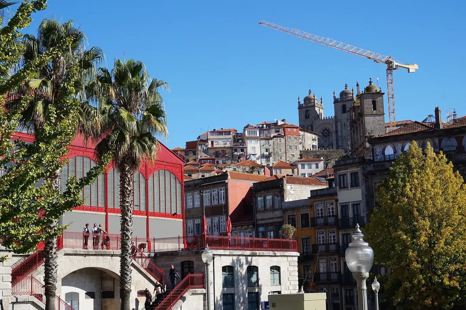
Bridges, railway structures and market halls brought industrial materials into the city's public image. Mercado Ferreira Borges is a compact example: a red iron market building from 1885 that outlived its original purpose and became a cultural venue.
Azulejos
Pictures that belong to architecture
At São Bento, churches and residential façades, ceramic tiles work as weatherproof skin, ornament and storytelling surface. Look at how panels meet doors, stone frames and corners — the interesting part is often the way an image becomes part of a building.
Read the city
Old structures keep learning new uses
Porto's character comes as much from reuse as preservation. Markets become venues, warehouses become museums and old streets absorb contemporary studios. Made in Maia follows the same instinct: local references become new designs, and a label becomes a link to the next story.